 |
| All photos DC unless noted |
Pictures from a recent trip to New York
Rafael Viñoly's pencil tower as seen from 57th Street. I still like it. Well-resolved facades - direct, elegant, no nonsense, no shame. Looks good --or at least commands attention-- from all over town and the region. Very New York. A crowd of these? Art history teachers always liked San Gimignano, right? And income disparity is nothing new in New York.
Another plus: it makes Trump Tower look small.
 |
| From designboon.com |
Each window measures approximately 10 x 10 feet. Interiors by Deborah Berke: http://www.designboom.com/design/deborah-berke-on-the-interior-design-of-432-park-avenue-01-17-2014/
Double-height technical floors are open to lessen wind loads, breezes pass through them. There is an elaborate system of dampers and floor slabs have added mass on upper floors to lower oscillating movement under wind pressure:
https://en.wikipedia.org/wiki/432_Park_Avenue
Portzamparc's tower on West 57th, with its fussy glass skin is, as Viñoly has said, "horrendous".
https://www.dezeen.com/2016/05/13/rafael-vinoly-apologises-432-park-avenue-super-tall-skyscraper-new-york-comments-screw-ups/
 |
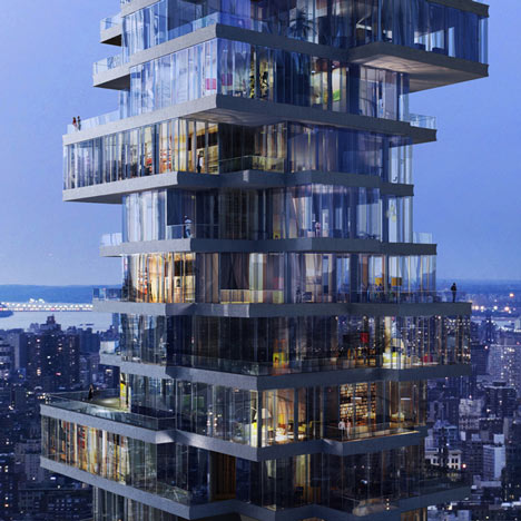
| Herzog & de Meuron, 56 Leonard Street. Source: Dezeen |
A summary of star-architect designed projects underway in New York from January 2016, including three by Herzog & de Meuron and one by Álvaro Siza:
https://www.dezeen.com/2016/01/29/16-residential-luxury-condos-famous-architects-changing-new-york-construction-boom
An inside look at the tower by Viñoly and Herzog & de Meuron's Leonard Street tower in Tribeca:
Justin Davidson
"Fancy Prisons for Billionaires Are Reshaping the Manhattan Skyline"
New York Magazine, May 9, 2017
 |
| Photo: Jeff English |
The idea of living there isn't very appealing. Too much like a beehive, you imagine the warren of narrow corridors on every floor, and the little studios and one-bedrooms. Like an over-dimensioned college dorm or, inevitably, decks of a cruise ship.
The location is not attractive except for the river views for the best units, but that's nothing new on Manhattan's formerly industrial and fast-developing Hudson River environs.
More on this project in my blog entry of May 12, 2015

Food truck in front of the Metropolitan Museum of Art. Who needs art?
New Jersey skyline from Battery Park City. A mess. I wonder what walking around Hoboken is like nowadays.
Pier 32
Central Park Reservoir. The last time I was here (1980s?), the fence was chain link. The transformation of Central Park is amazing.
Posing for bridal photos in Central Park's Conservatory Garden. Future husband looks on.
Previous post on my New York visit:
Postcard from New York
04.25.17


No comments:
Post a Comment
Note: Only a member of this blog may post a comment.