Wednesday, January 29, 2014

Cold Call in Aravaca


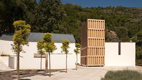
I'd been going past it for weeks on the bus and it gradually drew my attention. Was it some kind of office block, an unfinished parking garage, a bunker? The stonework was impressive, and those thick overhangs!


Going back on foot for a second look one day it hit me: it's the Sobrino House! One of Javier Carvajal's seminal works of 1965-66, where he mixes Wright's Falling Water, Mies' Concrete Country House and Le Corbusier's Maison Jaoul all in one ponderous, chilly spectacle. It's one of those houses of the period that go on forever, with servants quarters, bedrooms for half-a-dozen offspring and a regal spread of living spaces, terraces and patios.


Friends tell me it's been on the market for years. Instead of the big estate with ample grounds I imagined, its crowded onto a corner lot at a busy intersection in Aravaca, north of Madrid. It looks beautifully maintained, despite some changes. How long can it survive? You can't pick it up and take it somewhere else, like one of Wright's Usonian houses. Perhaps it could work as an embassy residence, a luxury medical clinic, an exclusive mini-hotel?
Ground Floor

See also my blog entry:
Javier Carvajal, 1926 - 2013 
August 9, 2013

Photos: DC
Plan: J. Carvajal, Arquitecto, Fundación COAM, Madrid, 1996, p 32.

Monday, January 20, 2014

Pretentious Lessons in Architecture I: The Door


The door and the wall. The door reveals the condition of the wall. Darkness and light. The darkness reveals the condition of the light. The light penetrates and unmasks the darkness. Its reflection and re-reflection illuminate, define and materialize the space,  this contained volume of air.

The opening opens the wall to these transactions. The controlled passage between darkness and light, the controlled interchange of darkness and light. The ornamented thickness of the cut in the wall frames and mediates this interchange, vibrating between light and shadow.

We see how the opening has been taken out of the wall, like parting a curtain, the force used to separate the weight of the wall bearing down to one side and the other. The vault of the opening springs up like an invisible force-field.

The wall holds the rest of the light back, like a dam, offering protection. The wall holds the darkness in like a cave.

The light is clarity, marking limits; darkness remains undefined, potentially mysterious, inviting or threatening. The light is sensual pressure, it caresses, scalds; the darkness is immersion - refreshing, chilling....


The compliment to the first photo: the dark portal seen from the brilliant light of the courtyard: darkness framed, revealed, contained. The Baroque door, negotiating the transit between the facade, or face of the building and its hidden interior, presenting face, representing.

The figure in the doorway: framed, presented, giving face - illuminated by the light of the courtyard, with the contrasting darkness of the doorway behind, like the portraits of Velázquez with their dark, neutral backgrounds that are nevertheless buzzing with light and spatial depth. The knight in the doorway at the back of Velázquez's Las Meninas, regarding the scene, returning our own regard. He steps throught the door, he emerges, guarding his back, presenting his face.

The doorway is an orifice, a mouth, a mask. It dignifies, qualifies those who emerge from it, it attracts, receives those who enter.

Enter here, but first contemplate my presence, my dignity, my grandeza. Feel welcome, protected. Pass through this threshold and be with us in peace. 


The Alhambra
Photographers: Rebecca Cohn and Scott Finkelstein
January 2014

For more of this stuff, see my unpublished article on Old Madrid in this blog.

Sunday, January 19, 2014

Enor Call for Entries

Juan Santos Domingo, Museo del Agua, Lanjarón, Granada, Premio Enor 2011
The bases are out for the VI Ascensores Enor Architecture Prize 2014 for work in Spain and Portugal, including works completed between 2010 and 2013. Deadline for entries is March 15, 2014.

The two main prizes are:
  • Ascensores Enor Grand Prize: 8,000 Euros
  • Enor Prize for work by an architect under the age of 40: 4,000 Euros
More information:
http://www.enor.es/premio

Enor is based in Vigo, Galicia. The Prize offers a window into the profession from a perspective different from the usual centers of self-attention in Madrid or Barcelona. I served on the jury a few years ago, at the invitation of its director, the architect Carlos Quintáns.

From the bases:

Entry form:

A Stroll in the City of Poets


Another island of quiet enchantment amid the inhospitable suburbs of Madrid, a development called the City of Poets, but originally known as the Dehesa de la Villa, for a nearby natural reserve whose hills and pines still survive, in bits and pieces, amid the complex (Metro: Antonio Machado). I wonder if any poets live there.

Like Almendrales (see post of December 29th), the key here again is a rupture with conventional city blocks in favor of an urban layout that adapts to the hilly terrain. The blocks and towers form the background to the terraced landscaping, with its retaining walls, courts, full trees and other cared-for vegetation, creating an environment of surprising peace and beauty.


It was designed by the architects Antonio Perpiñá, Luis Iglesias and Carlos de Miguel, with the engineers Ignacio Briones and Ignacio Marzal, and built in phases from 1964 to 1985. Its first phase was published in the magazine Arquitectura in 1969.


I still don't see why this kind of garden layout shouldn't be used more -- with ramps perhaps instead of stairs, as beautiful as they are. The concept is essentially Organicist, the Spanish variation on Brutalism, a style which I think was developed largely to create living environments well-adapted to the Mediterranean climate, open to nature while protected from the harsh summer sun.


Too bad so much grub accumulates on buildings in Spain, all the exterior cables and gas lines, the enclosed balconies, air conditioners,  and cheap aluminum windows, the lame globe lighting fixtures, and yes, the graffiti. And yes, the idle cars stuffed everywhere.


Like Almendrales, the complex includes a primary school, a small shopping center with a supermarket, and a church.

I took the pictures mainly to capture the ambiance. It's what really counts, I think. The apartment layouts are well-handled, according to the Madrid College of Architect's Guide to the Architecture of Madrid, although I haven't seen them. (The site plan is from the Guide).


There are a number of higher towers amid the lower blocks.


The towers camouflage the complex from the outside, creating a good defensive barrier.


You really feel, as you enter the curving streets, or move down a shallow flight of stairs and under an open portico to the inner gardens, that you have discovered a special place.


Blocks built later hold their own, too.


Wednesday, January 15, 2014

MoMA Steamrolls down 53rd Street

MoMA Expansion © Diller Scofidio + Renfro
Everyone is weighing in on MoMA's plans to raze Willians & Tsien's American Folk Art Museum, on West 53rd Street, for their next expansion. It's a local fight, but I am still a local when it comes to New York.

Some interesting quotes:

"The Museum of Modern Art is a perpetual work in progress. It’s never been finished.”
Glenn D. Lowry, MoMA Director

“I know the architecture community was hoping the conclusion would be different.”Elizabeth Diller, of Diller Scofidio + Renfro (DS+R), who are designing the museum's expansion. Implying that this question is of no wider import, and does not affect the public interest?

“We don’t collect buildings. We take architecture seriously, but it isn’t art. Architecture is tied to function."
Boom! Glenn Lowry, in a verbal blitzkrieg of executive expediency. Run for cover!

“The current lobby, we feel, is quite mean. There’s a banality about it.”
Diller on plans to redo the existing museum lobby, result of last expansion by Yoshio Taniguchi. Finally someone said it.

Michael Kimmelman, architecture critic for The New York Times, on the current museum:
"MoMA is now as jammed and joyless as the Van Wyck Expressway on a Friday in July. That’s not because it is a victim of its own success; it’s because the museum is a victim of its own philosophy. ... . I remember the temporary home the museum occupied in Queens during its last renovation. It briefly got MoMA out of its Midtown straitjacket and closer to its pioneering roots."
 And on the problems and virtues of the Folk Museum building:
"Wedged onto a narrow plot, the ill-fated folk art building is far from perfect. Inside, it’s mostly stairwells and passages, its galleries tricky to install. But the eccentricity helps to account for what endears it to architects. Those bespoke, domestic-size spaces, like the building’s sober hammered bronze facade, share something with the handicraft of the folk art museum’s collection; the building has a rootedness, a materiality, an outsize claim to significance. It stands proudly on the street, the unfashionable antithesis of generic, open-ended modernism, the opposite of what Diller Scofidio now envisions in its place, with its paradigm of indefinite and perishable culture."
Update January 20  
Later this week Diller was interviewed by architecture critic Christopher Hawthorne in the Los Angeles Times, with more interesting statements:
"I think the reason this [Folk Art] building was very difficult to transform into something else was its degree of idiosyncrasy. If we were to eliminate a lot of those idiosyncrasies, we could use it. But at a certain point it takes on another identity."
"Connectivity to the street [is] something we talked abpit on our first interview with MoMA: the art now is half a mile away from the entrance. MoMA could have a better civic presence generally, and the entrance on 53rd Street could be more generous, be a double-height space. There are a number of gestures that make the entrance more inviting. When it becomes more efficient and cleaned up, there could be great options for showing art there." (Edited by DC)
Hawthorne's original criticism of the proposal, published on January 9th in the LA Times, is also worth quoting:
"The idea that a museum would acquire and then demolish an important piece of contemporary architecture is unfathomable to many artists and architects in New York. While I admire the building, I don’t think the Folk Art Museum is the masterpiece some of my colleagues believe it to be; its interior is mannered and overdesigned, its dark and contorted façade presenting a kind of barricade along the streetscape."
"The idea that endlessly enlarging museum buildings will provide a better experience for visitors is almost never borne out by the architectural gigantism that results. On the contrary, the most powerful encounters we have with works of art tend to take place in the smallest and most intimate -- and even the most eccentric or impractical -- works of museum architecture. Efficiency and endless expansion are catnip to museum boards; they are often fatal to museum architecture."
The Folk Art Museum is hard to capture in photos. Here are a few, by my old friend Michael Moran:


Here's a schematic sketch of the new expansion prepared by DS+R and published in Architectural Record. The motor of the expansion is a new residential tower by Jean Nouvel, promoted by Gerald Hines, whose first floors will be given over to new gallery space -- a return to the real estate strategy behind the Cesar Pelli addition in the 1980s.
A couple of images of Nouvel's Tower Verre, as of last year, from Curbed:

  
I still miss the old Hotel Dorset on 54th Street, wiped out in the Taniguchi expansion. And every time I pass the sculpture garden I wonder how much longer the Rockefeller apartments can hold out across 54th Street. What would the garden be without that backdrop? But of course what i really miss is the old museum, which in memories from college trips in the 1970s was as intimate as a private club. Those were the days.

Sources
Diller, first Lowry  quote:
Cathleen McGuigan and Laura Raskin
MoMA to Demolish Tod Williams Billie Tsien Folk Art Building After All
Architectural Record, January 8, 2014

Second Lowry quote:
Fred A. Bernstein
MoMA Defends Decision to Raze Folk Art Museum Building at Public Forum
Architectural Record, January 29, 2014

Michael Kimmelman
The Museum With a Bulldozer’s Heart
The New York TImes, January 13, 2014

Christopher Hawthorne
MoMA reaffirms controversial plan to raze Folk Art building
Los Angeles Times, January 16, 2014

Christopher Hawthorne
Elizabeth Diller Defends MoMA Plan to Demolish Folk Art Building
Los Angeles Times, January 16, 2014

Sara Polsy
Moma Mia! New Renderings Revealed for Jean Nouvel's MoMA Tower
Curbed, December 10, 2012


NEWS UPDATES

David W. Dunlap
"Folk Art Building May Be Lost, But Facade Will Live: In Storage Some Place"
The New York Times
February 12, 2014

David Cohn
"The Short Life of Another Little NY Masterpiece"
The View from Madrid
February 10, 2014
Standford White's Madison Square Presbyterian Church lasted just 10 years. 

"MoMA Begins Demolition of Folk Art Museum Building"
Webpage news story
Architectural Record
April 14, 2014

Robin Pogerin
Architects Mourn Former Folk Art Museum Building
Talk with Tod Williams
The New York Times
April 15, 2014

Tuesday, January 14, 2014

Looking Off the Map


Trevor Paglen
Open Hangar, Cactus Flats, NV, Distance ~ 18 miles, 10:04 a.m
C-Print
30 x 36 inches
2007

Trevor Paglen doesn't exactly document off-map secret US military and spy facilities. He hangs his photos in galleries and sells them to collectors, and he takes his shots with the historic context and tradition of landscape painting and photography in mind, especially, it seems, those old ideas about the romantic sublime.

I finally caught up with a New Yorker profile of him published last year, which can be found on his website here, where he explains his approach.

I don't quite get it. Is selling this as art a way to finance the work? No, he takes himself seriously as an artist. But I think all that purposely blurry stuff is the least interesting thing about his work.

In the New Yorker article, he complains to the writer at one point during a shoot that the atmosphere is too clear. On the photo above, he writes.
"Limit-telephotography most closely resembles astrophotography.... In some ways, however, it is easier to photograph the depths of the solar system... Between Earth and Jupiter (500 million miles away), for example, there are about five miles of thick, breathable atmosphere. In contrast, there are upwards of forty miles of thick atmosphere between an observer and the sites depicted in this series."
Fair enough. But outing secrets is what counts for me, documentation as a political act, showing that these places, although off the map, are in our lives, in our minds, in our culture, in our relations with the rest of humankind.

Besides looking into Area 51 and other secret sites, he actually tracked down a secret CIA prison in Afghanistan. Good for him.

The Salt Pit, Northeast of Kabul, Afghanistan
C-print
24 x 36 inches
2006

My counter example would be Camilo José Vergara, who without any pretensions, and initially with many sacrifices, documented the unseen decaying inner cities of North America, from Detroit and Gary, Indiana to Camden and the Bronx. I've been reporting on him for years. His archives were bought a few years ago by the Getty, and he's had several books published, so the recognition is there. And there's no nonsense about art and mystery, though the images are as powerful as any you'll find.

Trevor Paglen website
http://www.paglen.com

Jonah Weiner
Prying Eyes
The New Yorker 
Oct 22, 2012 p 54-61

Trevor Paglen
Invisible: Covert Operations and Classified Landscapes
Aperture, 2010

Annie Jacobsen
Area 51
An Uncensored History of America's Top Secret Military Base
Orion, London, 2011

Camilo José Vergara
The New American Ghetto
Rutgers University Press, 1997

Thursday, January 9, 2014

Calatrava Update: Heads Up for Falling Trencadís

Photo: Efe via Heraldo.es

In a winter storm last month, sections of the tile facade came off Sanitago Calatrava's Palace of the Arts in Valencia. The regional government announced it will consider suing the architect and the builders for damages.

Areas of "wrinkling" or buckling tile were first observed early last year, but neither the builder or Calatrava assumed responsibility, according to the government. The building's curving surfaces are covered in a mosaic of broken tile known as trencadís, adapted by Calatrava from the works of Gaudí. The building cost 478 million euros, including a 44 million euro fee for Calatrava, the Spanish newspaper El País reminds readers in its December 27th story on the problem.

A Europress story published in the Heraldo de Aragón yesterday offered the government's first evaluation of damages. A preliminary study finds 60% of the facade affected. Engineers recommend the complete removal of the tiles and their replacement with white paint over the steel under-surface (sounds pretty tacky, doesn't it?). The estimated cost is over 3 million euros, plus the expense of cancelling the opera Manon Lescaut, scheduled to open February 2nd (another 600,000 or more). Officials hope to have the building secured for the next scheduled opera on February 23rd. The work will also affect the filming of the Disney movie Tommorrowland scheduled this winter. 

Update March 1, 2014


The Palau stripped bare of is trencadis, even. From El País, April 2, 2014. Photo: Tania Castro. The white spots are test areas for sample paint.

Update Jan. 10
El País informs today that Calatrava and the builders have met with the local government and agreed to find a solution to the problem and pay for the costs, thus adverting a possible court case.

The problem appears due to the different coefficients of expansion under temperature changes between the tile and its steel backup. No problems have appeared where tile is applied over concrete, the engineers' study reports.


Joaquín Ferrandis
El Consell emprenderá acciones legales contra Calatrava y la UTE de Les Arts
El País
December 27, 2014 

Europa Press
Valencia estudia demandar a Calatrava por los daños en el Palacio de las Artes
Heraldo de Aragón
January 8, 2014

Ferran Bono
Retirar el ‘trencadís’ del Palau de les Arts costará tres millones de euros
El País
January 10, 2014

Ferrran Bono
El Consell asegura que Calatrava y la UTE reprarán Les Arts y asumirán el coste
El País
January 10, 2014 

Agencia Efe
El despacho de Calatrava y UTE asumirán la reparación del Palau de les Arts
El País
January 10, 2014

Ferrran Bono
Calatrava's opera house: a rip-off?
El País (English edition)
January 12. 2014
 
Opinion
Anaxtu Zabalbeascoa
'Trencadís and footing the bill
El País (English edition; article at bottom of page)
January 12, 2014

José Ramón Giner
Un 'trencadís' cultural
El País (Valencia edition)
January 12, 2014

Ongoing compilation of news stories in El País:
http://elpais.com/tag/santiago_calatrava/a/

Saturday, January 4, 2014

Quote of the Month


"Some people use only the color white, or only 90 degrees. What defines their style is the sum of all their inhibitions. And I think we try to put ourselves in a position where we can be free to choose any weapon of choice in each and every case to match the context, the culture [and] the climate in the best possible way." 

Bjarke Ingels, asked about why his work supposedly doesn't have a recognizable style (although I would disagree). Good one to the solar plexus of uptight American practice.  

Quote from:
"Bjarke Ingels: An "Architect For A Moment Or An Era?"
NPR (National Public Radio), USA
January 03, 2014

I chosse Bjarke Ingels as Architect of the Year in December's Gentleman (Spanish edition).

(More goodbyes: this will be my last collaboration with the magazine, which closes with the January issue.)  

Arquitecto sin fronteras
Bjarke Ingels, Architect of the year
Gentleman, December 2013, page 24

Photo, Dan Bobkoff for NPR